Kometa
This hotel aggregator case study is aimed to present solutions backed by gathered data. Overall, the goal of the project is to include only necessary features that aid the primary task of the target audience – to book a room.
The interface must also be intuitive, follow the industry conventions, and be kept uncluttered yet informative and transparent.
Role
UX Designer
Duration
5 months alongside coursework. Finished in the 1Q of 2022.
Tools
Pen&Paper, OBS Studio, Zoom, GIMP, LibreOffice, Miro, Figma.


Research
Conducting research allowed me to understand how goals of users are being achieved.
I have initially conducted competitive benchmarking to allow me to identify what industry competitors are doing right and learn from what they are doing wrong.
User interviews and usability tests gave me an understanding of user goals, their behaviour and the context of use when using products from industry competitors.
Based on gathered qualitative data of behavioural and attitudinal nature, I have proceeded to the next step of the UX process where I define and build towards creating the design for highest-frequency use case on this upcoming hotel aggregator website.


Define
The research results were then analysed to reveal some commonalities and patterns with the help of Affinity diagram. Overall it introduced structure to the research findings. It was a collaborative exercise where one other person was enlisted to add perspective for deeper insights.
Customer journey map served well for visualizing the storyline of overall experience. It allowed to see where the biggest pain-points lie in the existing experience flow and what this design must prioritize in solving from the customer’s point of view.


Collaborative analysis identified specific pain-points:
“What hotels are near the seaside?"
*Opens google maps in a new tab*
Unclear differentiators
It’s especially irritating for users to be clicking on items blind, with nothing else to guide them but the name or a title. It invites users to be searching more information on other websites, just to make a decision on the current one.
“Can't find anywhere to book this!"
"I have no idea what that means.
Absolutely no idea"
Hindered flow, and lack in consistency and standards
Context of use will vary for every person visiting the website. Nevertheless, majority of interactions should be consistent with their mental models. Users do not want to work hard to find the next step they want to take towards their goal of booking a hotel.
“Wasn't it already with a double bed?"
"What's added to the room?"
Clarity and transparency
Uncertainty towards price or items included in the purchase do not inspire confidence in user choices. Disorganized sections can be intimidating, thus prolong the time it takes to chose any additional services. Confusing information can be a deal-breaker, especially when it comes to payment page where summary is unclear.
Goals for the design
Be intuitive
Provide clear path to complete macro as well as micro tasks.
Make it very clear to user about “where am I” and “what do I do next”.
Give differentiating context
Provide more visual differentiators to aid decision making process between choices.
Aid information transparency and comprehension
Descriptive, thorough and organized information about what is offered is given to people as they progress through website.
Design
To picture overall user journey through this new design, User Flow gave a good detailed description of all steps for a task to be completed and set the foundation for the solution mode.
I used Figma tool to create medium-fidelity prototype that was later tested and graded. All constructive criticism provided gave great tips for final iterations of the design.


Homepage
Intuitive start
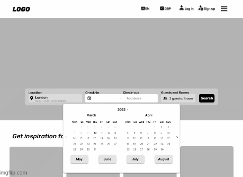
Research showed people sometimes searching for their starting point. On top of complementing hero image, search bar is central and fully expanded starting point.
Populated fields with placeholders indicate the place to type your information and the bar itself progresses as selections are made.

Fast lane calendar
When choosing a date further from present, every click counts. Therefore, the calendar that normally has only arrows for navigation between months is complimented with the inclusion of future half year.
Hotel listings page
Organised listings
Hotels must have some differentiators besides the location, therefore listing includes necessary information that can be sorted.
Besides added filter quick-buttons there is additional information on every listing, such as clickable photo album, most applicable room available in each listed hotel and show applicable filter, if selected.

Visual differentiator
Layout is important for information comprehension. Due to interest for visual browsing location conscious users have, screen is split to accommodate listing as well as map function, to avoid people leaving the website and potentially getting distracted from their task.

Room listings page
Interactive secondary navigation
Interactive navigation provide people with more context of where they are and leads them towards where they want to go.
Data shows that users either scroll or use the secondary navigation, therefore to accommodate two mental models - both instances would be developed.

Listing transparency
Necessary information about every room is provided on every listing. While compact, it is visually and contextually descriptive thus serves well for easy comparison.
With the use of visual hierarchy, action buttons such as “+ Add your stay” and “Book it” do not compete for attention with text.

De-cluttered "Add-on" section
Organised collection of add-ons allows for a quick scan on a newly opened overlay.
Disorganized information can overwhelm any user, therefore every available item includes a description and a visual representation of the service/product with a clear indication of action and confirmation buttons.
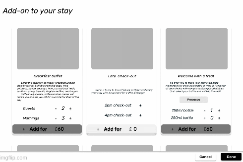
To further aid listing transparency – after add-on selection, all listings recalculate the total price for any of the rooms available in the hotel. As all prices update, Add-on tag is attached at the top of the price summary with the sum that was added.

Payment page
Intuitive and transparent layout
The primary navigation transforms into a minimalist design to remove distractions. Additionally, page is locked in a necessary data collection stage, which location is shown in the progress bar aiding focus on task present.
The order summary is provided with a room preview and price breakdown, that lists all costs that make up the final figure.

Clear and descriptive form design
Form was designed with a clear path to completion in mind and interacts with users by giving timely feedback to inspire confidence.
Each label leaves no hesitation as to what goes into each field, nevertheless, to aid clarity some labels hold contextual help, while each field has placeholders.

Iterations
Iterations were done with the help of performed usability test for design solutions validation and coursework handover of the final version of mid-fidelity prototype.
Following are the iterations made:
-
Prototyped search-bar location input to reflect the read world interaction - user can insert a full name of the location, encouraging a more realistic feel.
-
Calendar function now has both - slow and fast lane month picking, so that people can use conventional method - clicking the arrow button "next".
-
Calendar fast lane buttons are now pushed higher up, so they are more prominent on the screen by being above the fold.
-
Made all "hotel cards" listed in the same size to aid scannability and bring consistency to the design.
-
Included default state of the "sort" filter - it's now more informative and clear in what way the list is organised.
-
Prototype interaction added to the Room booking page - user can now scroll to a wanted section OR click on the secondary transforming navigation.
-
Copy is updated to reflect the real world "Add-ons" selection and to include the differentiators prior to adding UI elements.
-
Took away X button (closing button) on Adds-on overlay for clarity of interaction with prototype. To close it - user needs to tap outside the overlay.
-
Payment page now lets the user click on "Add-on" in the booking overview to double check details of what is added to the room.
Annotated wireframes
As a final step, I created annotations for the prototype that helped describe to developers what needs to be built. Wireframe aids the next phase of the product development with detailed information on interaction of each screen interface.

Interactive prototype
I created a medium-fidelity prototype in Figma to demonstrate the interactions and full single use case flow of the product.
Single use case scenario
Location: London (type it out)
Dates: 2022, August 11th -14th
Guests: 2 adults
Room: room with double bed, free cancellation included in the price.
Additional: include add-on "breakfast buffet" to the booking of the room.
Payment page interaction: Fill in any field with "ENTER" keypad press.
Result
The solution and all documentation were delivered to the course advisors for evaluation and all have received positive results. Some iterations were made after the usability test was carried out in order to validate design solutions.
First and foremost, UI design is the first step to getting this website published in the real world as the aesthetics of the webpage would be a crucial component to its success.
In case this website goes live, It would be crucial to expand from having only one user case for this design, as otherwise, it would be too limited in interactivity. As well as that, it’s equally important to evolve the website into a responsive design solution.
Afterwards, first metrics of success to measure would be the conversion rate and time.
I appreciate you stopping by
If you want to know more about me or simply grab a cup of coffee, please reach out. I would love to hear from you!